The Science Diet
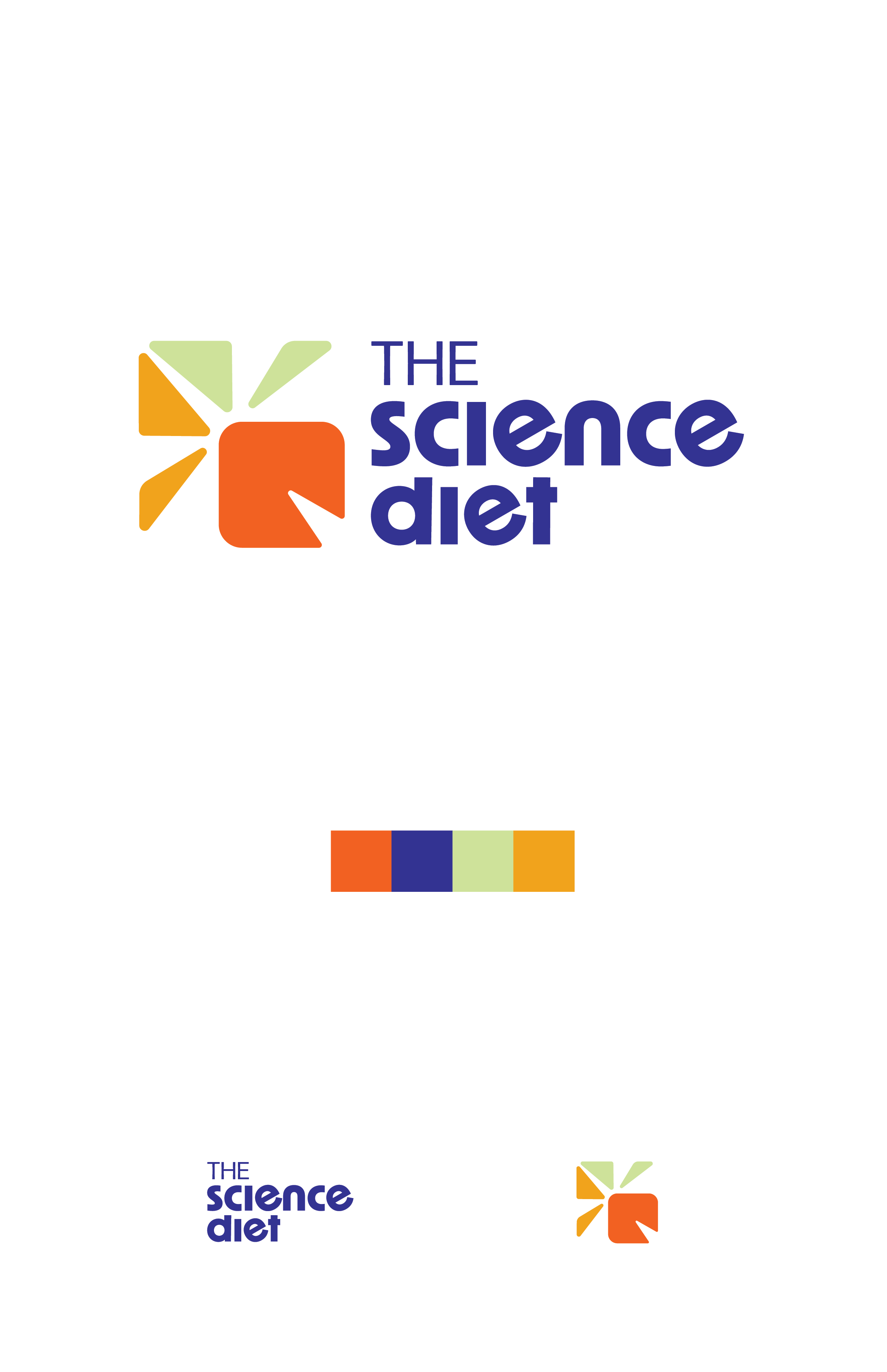
This project was a complete redesign of an already existing company. Originally Hill’s Pet Nutrition, The Science Diet reclaims its science-based nutritional philosophy and aims to serve a larger market of pet owners, breaking the shackles of outdated tradition as the original brand suggests. With the redesign, I wanted to emphasize the plant-friendly, science-based nature of the product and draw a younger market of pet owners, using simple yet playful colors and design elements.
The project required market research for current national pet owners as well as what Hill’s consumers looked for in their diet. Final assets included branding guidelines; logo variations; packaging design; website; social media; and campaign posters.

Packaging
The Science Diet’s packaging is the most important design product of the company. A lot of attention to detail had to be placed on the difference between the normal science diet and the prescription. Subtle color pallete differences, as well as
Business Items
Business items including individual and company business cards, front and back; envelope with company logotype and address; and letterhead.
Website
The website design had to reflect not only the branding guidelines, but also the items within the business including products and campaigns. Website includes home page, product browse, product page, and campaign page.
Campaign
The company’s campaign is achieved through a series of three posters and Instagram graphics. The campaign highlights their Food, Shelter & Love Program; Disaster Relief Network; and Global Pet Nutrition Center. These programs donate millions of
Branding Guidelines
Included in The Science Diet’s standard manual is a brief overview of specific branding guidelines, including logotype restrictions and color guides. The logo must include the four company colors: Ruff (orange), Kitty Blue, Biome Green, and Burnt Yellow. They may also be reversed out.
Market Research
The market research for this company required an extensive written report on current pet owner statistics, as information on the original company, including their brand mission and values. The process included notes and mind maps on
a spacial emphasis on the prescription ID (ex: k/d). “Badges” with unique symbol and color codes differentiated cat and dog diets. See-through packaging cut-outs reflect the paw shape of the logo. Wet food can packaging was also considered.
dolllars in food to animals in need across the country, mainly victims of natural disasters. The Global Pet Nutrition Center cares for hundreds of cats and dogs that help develop the right taste and nutrient levels for The Science Diet products.
company values, and an emphasis on their science-based diet. This was important in order to determine a difference between their prescription options, which is a large part of their product and consumer base.


